Portfolio
About
Shop
Contact
Lucy Wang
Portfolio
About
Shop
Contact
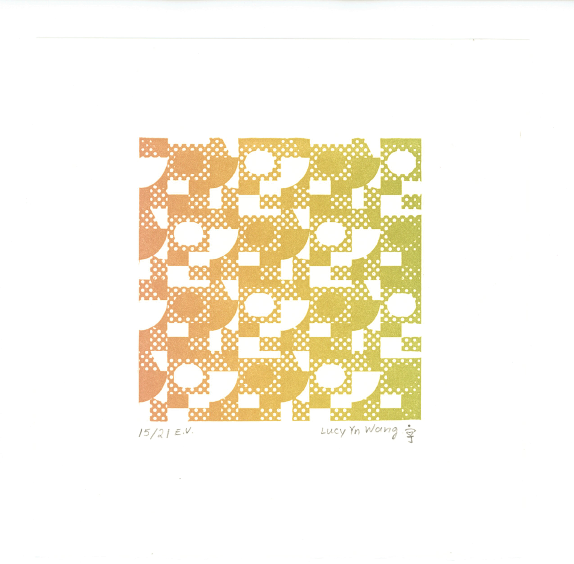
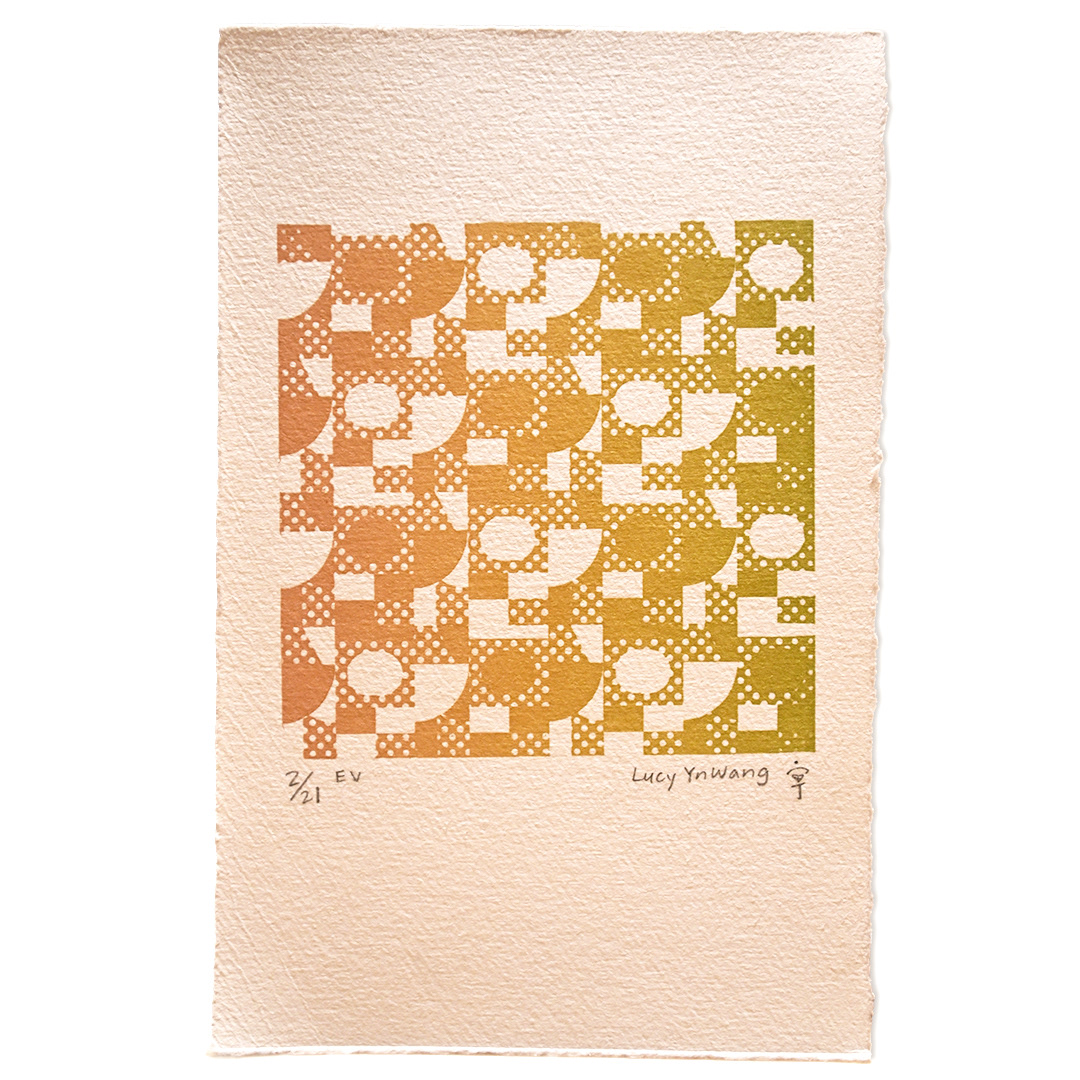
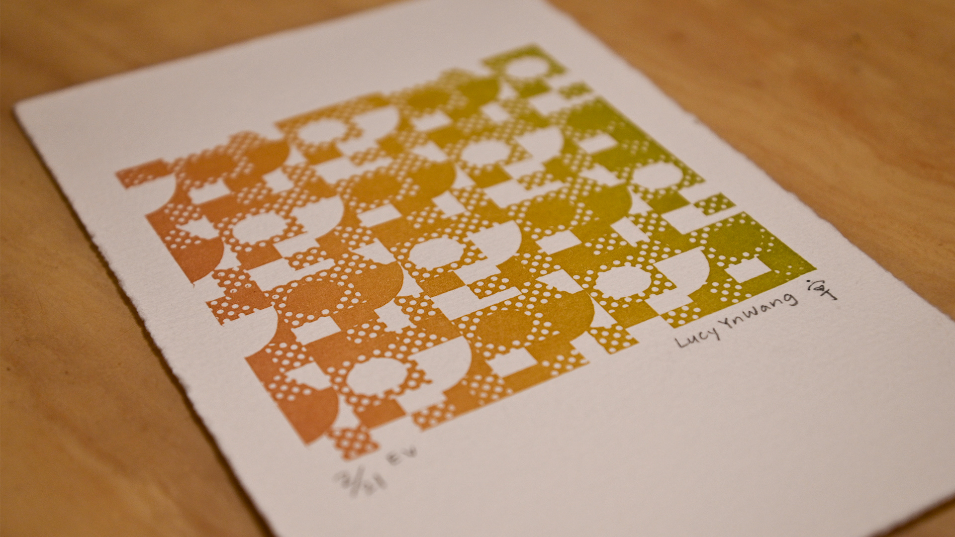
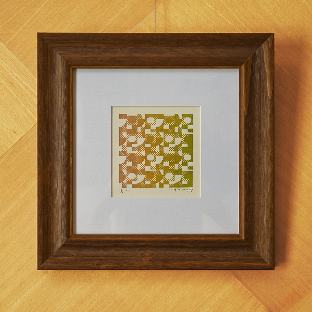
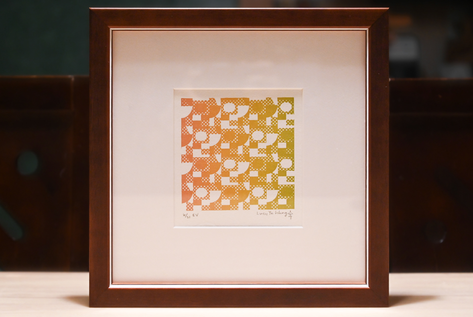
福與風
Breeze of Grace
2025
Color relief on wove paper
Photopolymer letterpress
16 x 16 cm
(image size), 11" x 14" (framed)
Description & Details (PDF)
↑
Back to Top